THE team from AltCoinEdge reached out to me for a new logo, and after some initial meetings we came to the conclusion a full rebranding was needed.
The ACE team wanted a youthful wordmark evoking the feel of graffiti but with high legibility, and a tech-friendly blue-and-yellow palette.
Together, we employed human-centred design processes in co-creating personae of our our target audiences. This robust alignment grounded all our iterations going forward, as we continually referred back to our original problem statement and considered our customer's perspective in all designs.
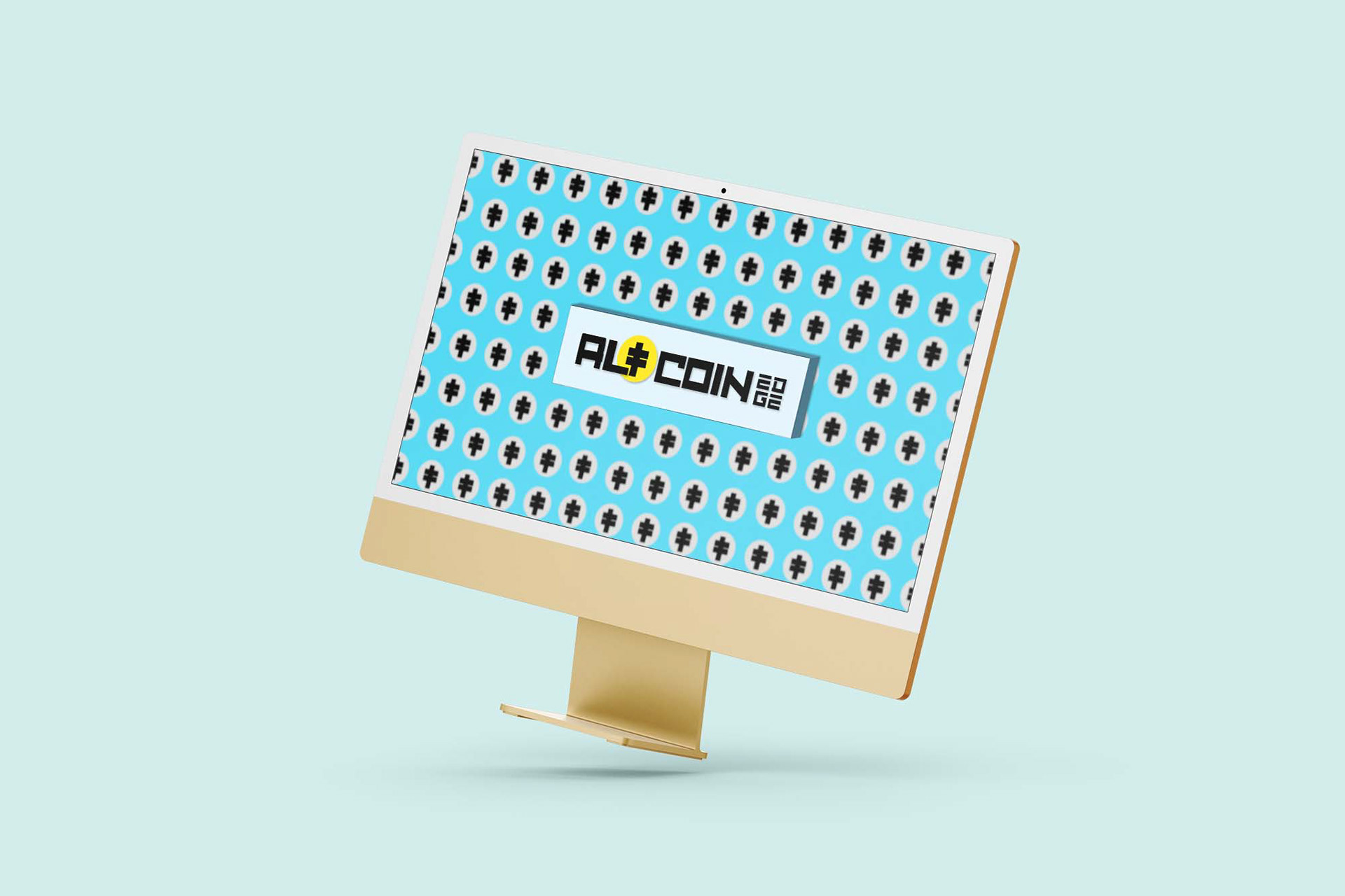
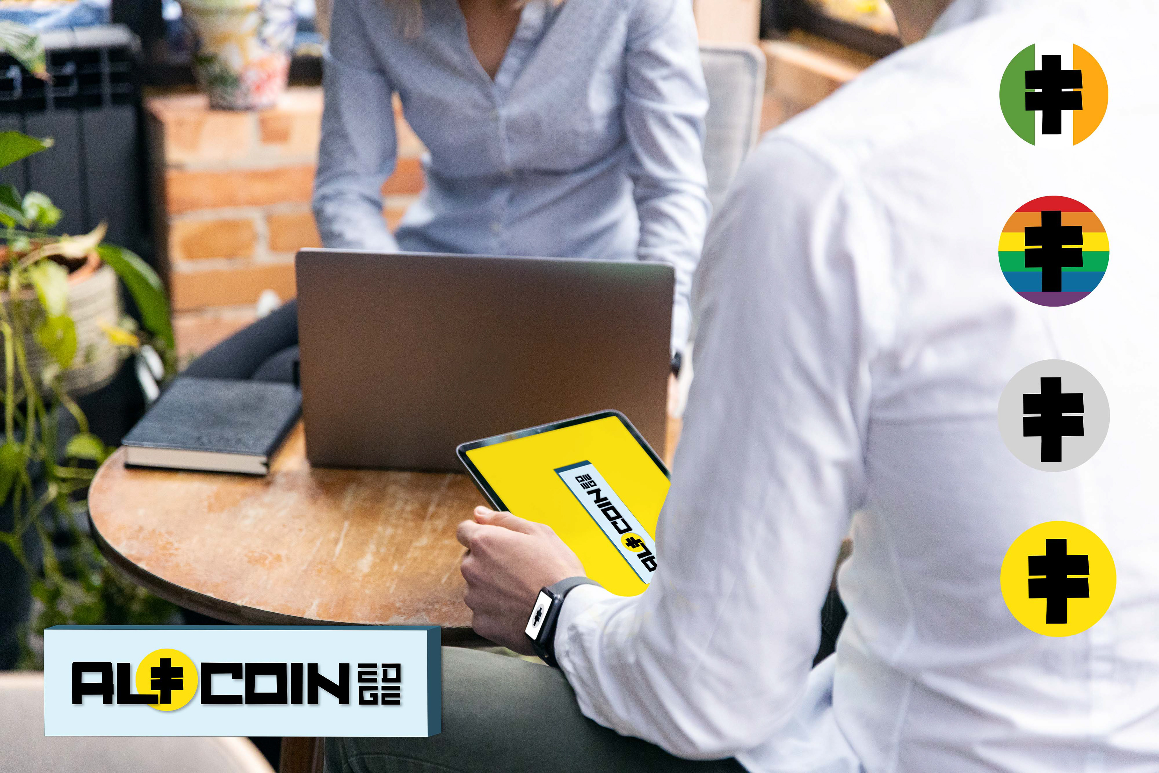
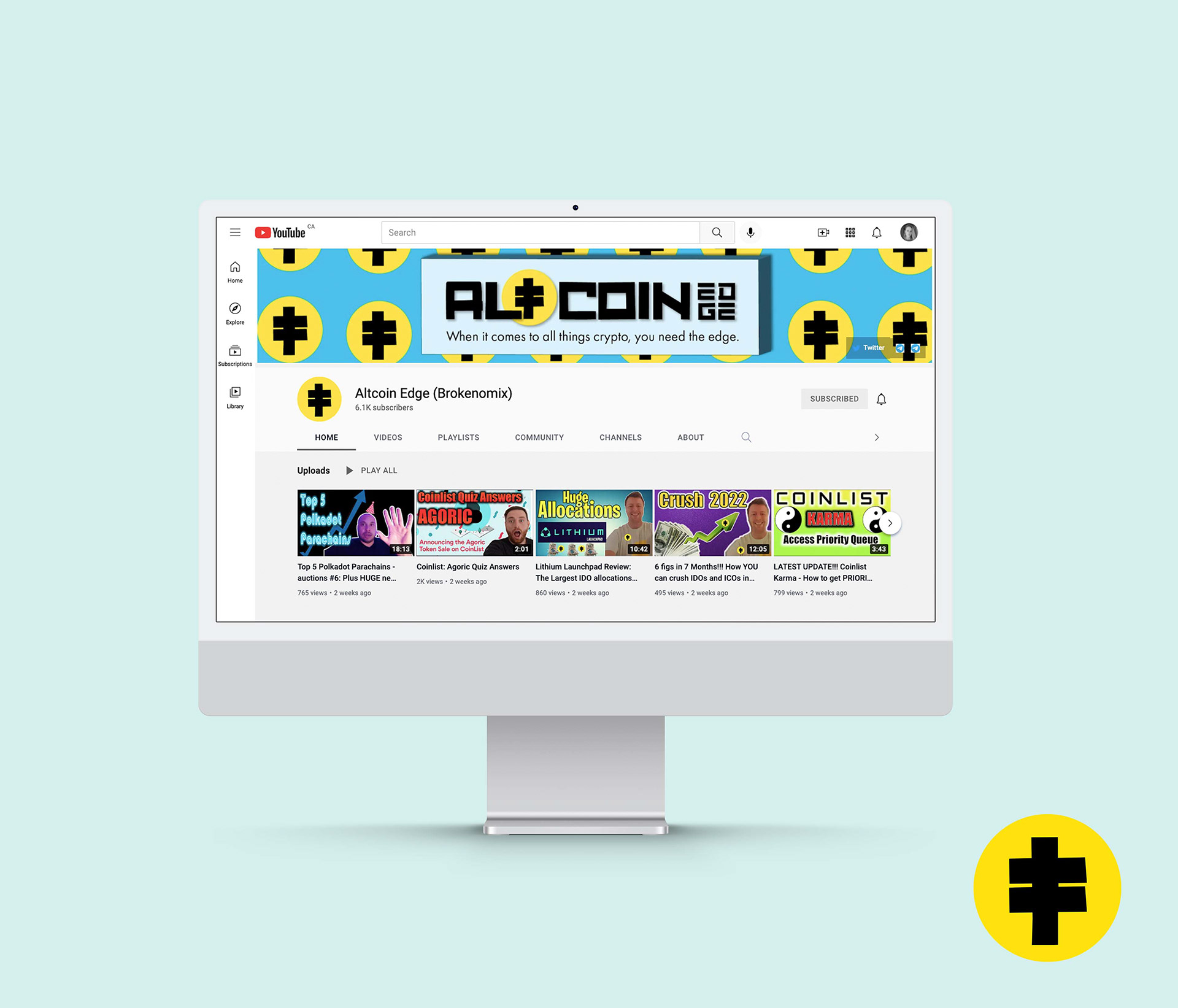
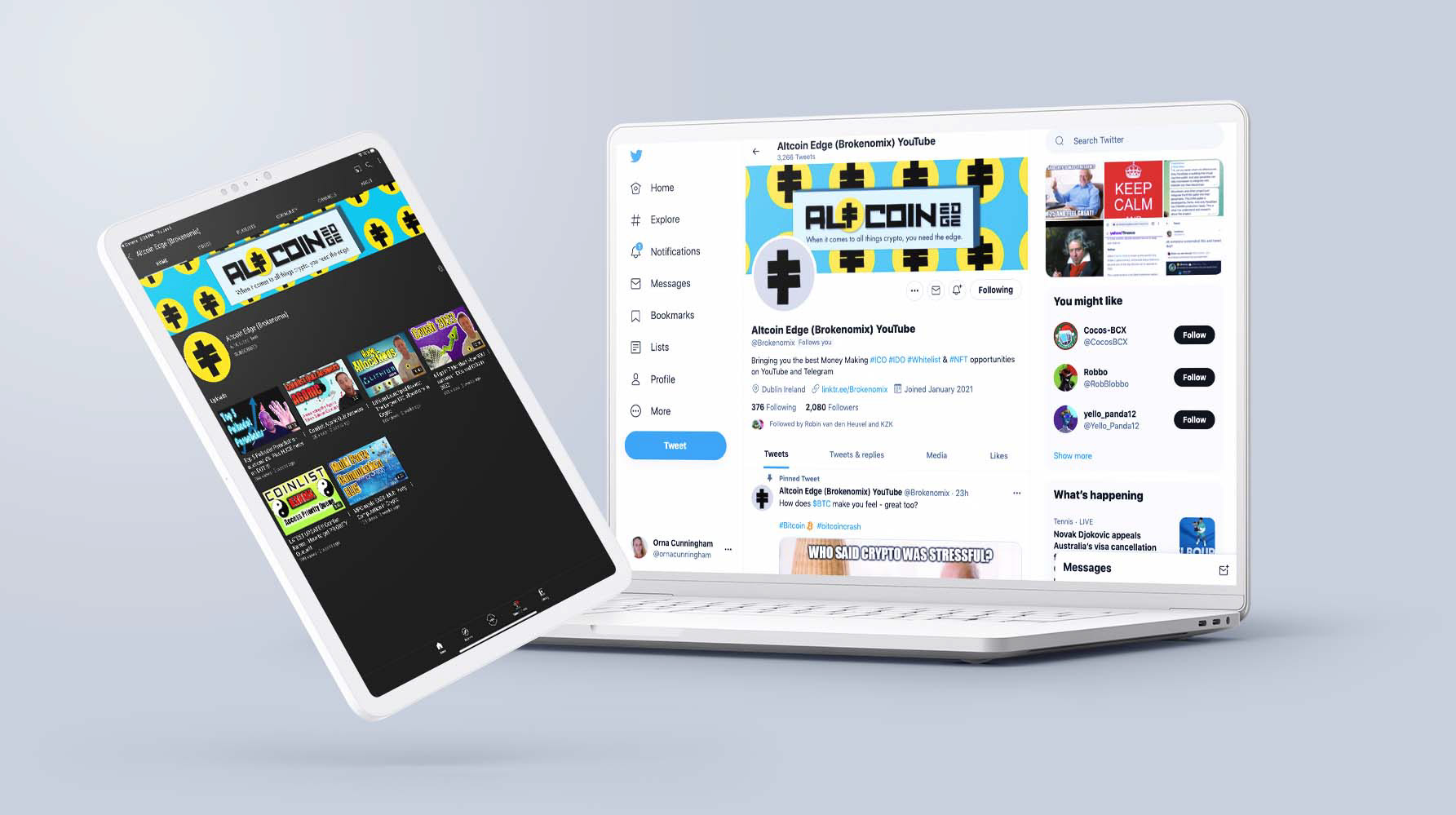
Pictured are Youtube and Twitter banners, Youtube presentation wallpapers, wordmarks, and logos (including LGBTQ+ and St. Patrick's Day-themed logos for the Irish team).
The logo is derived from an earlier 'T' considered for the wordmark, which evolved to represent an electricity pylon - a conduit without which cryptocurrency wouldn't be possible. It also represents a broadcast mast, relating to the team's work - the business of commentating on cryptocurrency and crypto projects.